If you want a tiny chart that lives right inside a single cell, with no chart object to position or resize, the SPARKLINE function in Google Sheets does exactly that.
It turns a row of numbers into a small line, column, or bar drawn in the cell itself. In this article, I’ll show you how to build line sparklines, column sparklines, in-cell progress bars, and colored variations.
SPARKLINE Function Syntax in Google Sheets
Here is how the SPARKLINE function is written:
=SPARKLINE(data, [options])
- data is the range of numbers to chart, usually a single row or column.
- options is an optional set of settings written as a curly-brace array, like
{"charttype","column"}. You use it to pick the chart type, set colors, define a max value, and more. Leave it out and SPARKLINE draws a default line chart.
When to Use SPARKLINE Function
- Show a trend for each row next to the data, without building a full chart.
- Compare values across a row at a glance using mini column charts.
- Build an in-cell progress bar that fills toward a target.
- Add color-coded mini charts to a dashboard where space is tight.
Example 1: A Basic Line Sparkline
Let’s start with the default, which draws a small line chart.
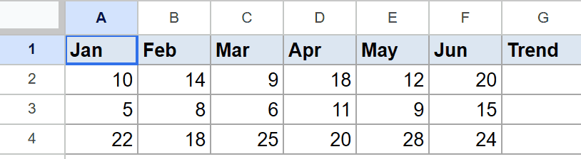
Below is the dataset, with six monthly values per row in columns A to F, across rows 2 to 4. Column G will hold the sparkline.
You want a mini line chart in column G that traces each row’s values from left to right.
Here is the formula:
=SPARKLINE(A2:F2)
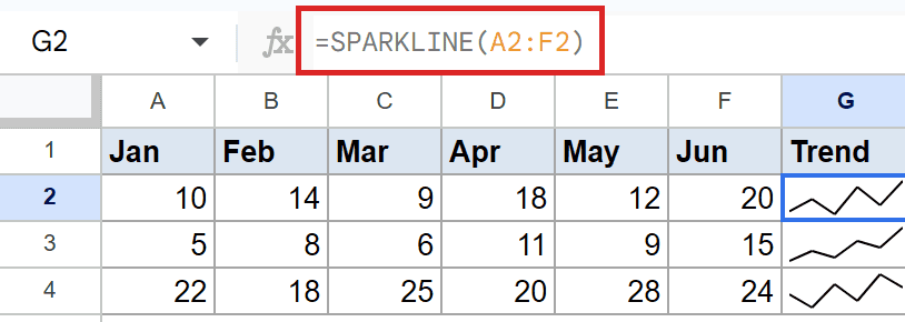
With no options, SPARKLINE draws a line connecting the six values in the row. In column G you see a small line that rises and dips along with the numbers beside it.
A row that climbs steadily shows an upward-sloping line. A row that wobbles shows a jagged line. The chart sits entirely inside the one cell.
Pro Tip: A sparkline scales to its own data, so the line uses the full height of the cell. Two sparklines in different rows can look similar even when their value ranges are very different. Compare the underlying numbers, not just the shapes.
Example 2: A Column Sparkline
When you want to compare individual values rather than a trend, switch to the column type.
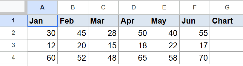
Below is the dataset, with six values per row in columns A to F, across rows 2 to 4. Column G will hold the sparkline.
You want a mini bar-style column chart in column G, one little column per value.
Here is the formula:
=SPARKLINE(A2:F2, {"charttype","column"})
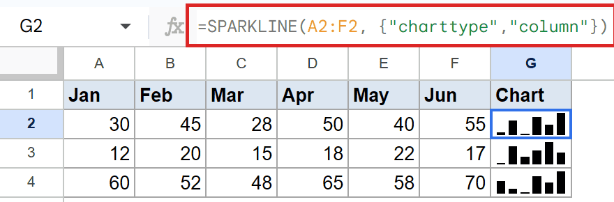
The option {"charttype","column"} tells SPARKLINE to draw vertical columns instead of a line. Each of the six values becomes its own little column inside the cell.
Taller columns mark the bigger values and shorter ones mark the smaller values. This makes it easy to spot the peak in a row without reading every number.
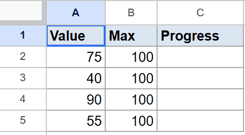
Example 3: An In-Cell Progress Bar
The bar type with a single value and a max setting gives you a progress bar, which is great for tracking completion.
Below is the dataset, with a current value in column A and a target in column B, across rows 2 to 5. Column C will hold the sparkline.
You want a horizontal bar in column C that fills based on how close column A is to the target in column B.
Here is the formula:
=SPARKLINE(A2, {"charttype","bar";"max",B2})
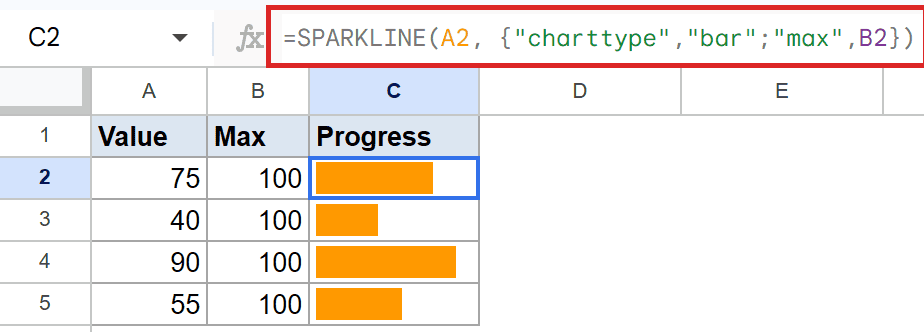
How this formula works:
"charttype","bar"draws a single horizontal bar instead of a line or columns."max",B2sets the full width of the bar to the target value in column B.- The bar then fills proportionally to how much of that target column A has reached.
A row close to its target shows a nearly full bar. A row far from its target shows a short, mostly empty bar. Semicolons separate the option pairs inside the curly braces.
Pro Tip: For a progress bar, always set “max” to your target. Without it, SPARKLINE picks its own scale and the fill no longer reflects real progress toward your goal.
Example 4: A Colored Line Sparkline
You can style a sparkline to match a dashboard or to signal good versus bad with color.
Below is the dataset, with six values per row in columns A to F, across rows 2 to 4. Column G will hold the sparkline.
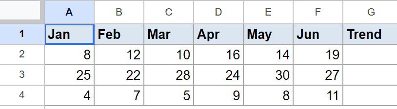
You want the same line chart as Example 1, but drawn in green.
Here is the formula:
=SPARKLINE(A2:F2, {"charttype","line";"color","green"})
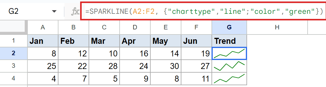
The options set the chart type to line and the line color to green. The shape of the line follows the same values, only now it’s drawn in green instead of the default blue.
You can pass a named color like green or red, or a hex code like #34a853. The same color idea works on column and bar sparklines through the "color" option.
Tips & Common Mistakes
- Options need quotes and the right separators. Each option is a name-value pair, pairs are separated by semicolons, and items within a pair by commas, all inside curly braces. A misplaced comma or missing quote throws
#ERROR!. - A sparkline is a chart, not a value. The cell shows a drawing, so you can’t reference it in math the way you would a number. Point your formulas at the source data instead.
- One cell, one sparkline. SPARKLINE draws into the cell that holds the formula. To chart several rows, fill the formula down so each row gets its own mini chart.
SPARKLINE packs a whole trend into a single cell, which is perfect for dashboards and summary tables where a full chart would be overkill. Pick line for trends, column for comparisons, and bar for progress.
A little styling with color and a max setting goes a long way toward making these mini charts readable at a glance.