When you want to know whether two columns of numbers move together, the CORREL function in Google Sheets returns the correlation coefficient in a single call. This article walks through four examples covering strong positive, strong negative, and near-zero relationships.
CORREL Function Syntax in Google Sheets
The function takes two ranges of equal length.
=CORREL(data_y, data_x)
- data_y – the first range of numeric values
- datax – the second range of numeric values, same length as datay
The result is always between -1 and 1. Values near 1 mean a strong positive relationship, values near -1 mean a strong negative one, and values near 0 mean no linear relationship.
When to Use CORREL Function
- Checking whether two metrics tend to rise and fall together
- Quick sanity check on whether a predictor variable matters
- Verifying expected negative relationships, like price vs units sold
- Sense-checking experimental data before deeper analysis
- Comparing several variable pairs to see which are most related
Example 1: Strong positive correlation between hours and scores
Let’s start with the textbook case, a tight positive relationship.
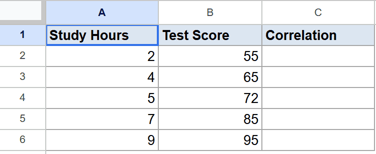
Below is the dataset, study hours in column A and test scores in column B, rows 2 through 6.
The goal is to measure how closely the two columns rise together.
Here is the formula:
=CORREL(A2:A6, B2:B6)
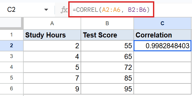
The formula returns roughly 1.00, which is about as close to a perfect positive correlation as you’ll see. Every extra study hour comes with a matching score bump.
Pro Tip: PEARSON returns the exact same coefficient, it’s just the older name. If you need the slope or intercept of the fitted line, use SLOPE and INTERCEPT alongside CORREL.
Example 2: Strong positive correlation in a sleep study
A second positive example, this time with six data points instead of five.
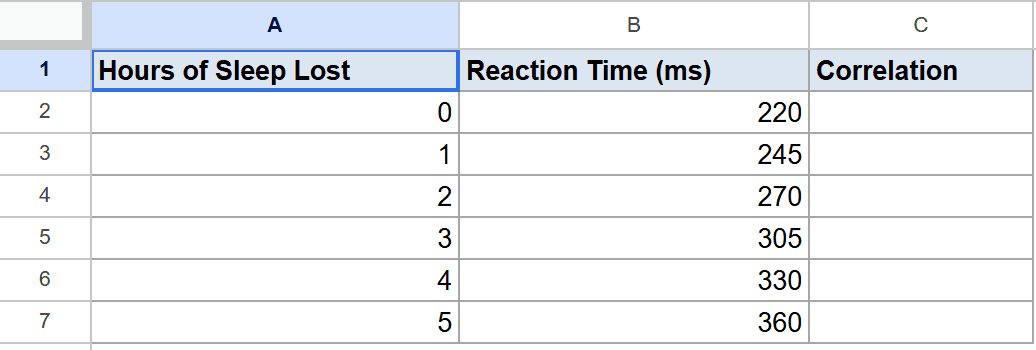
Below is the dataset, hours of sleep lost in column A and reaction time in milliseconds in column B, rows 2 through 7.
The goal is to confirm reaction time climbs as sleep loss climbs.
Here is the formula:
=CORREL(A2:A7, B2:B7)
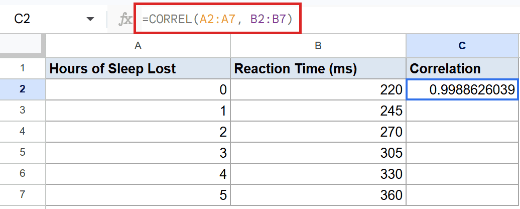
The result is close to 1.00, which says the two metrics move in lockstep. Reaction time climbs in a near-straight line with every hour of lost sleep.
This is the pattern you want to see when you suspect one variable drives another.
Example 3: Near-zero correlation between unrelated variables
Not every pair of columns has a meaningful relationship, and CORREL shows that with values near zero.
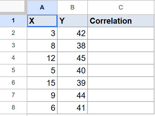
Below is the dataset, two columns labeled X and Y in A2 to B8 with no obvious pattern between them.
The goal is to confirm there’s no linear link between the two columns.
Here is the formula:
=CORREL(A2:A8, B2:B8)
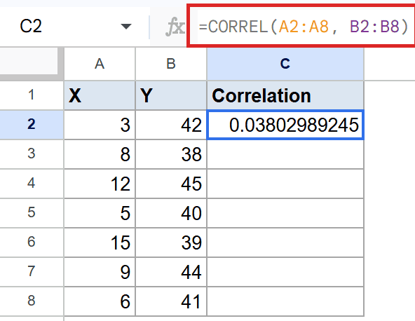
The coefficient comes back near 0.04, basically zero. That’s CORREL telling you the two variables aren’t linearly related.
A near-zero result doesn’t rule out a curved or threshold-based relationship, only a straight-line one.
Example 4: Negative correlation between price and units sold
A negative correlation shows up as a value close to -1, meaning one variable falls as the other rises.
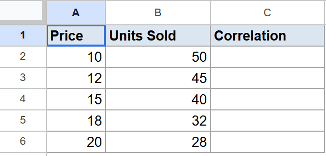
Below is the dataset, product price in column A and units sold in column B, rows 2 through 6.
The goal is to confirm the expected demand pattern, higher price means fewer units sold.
Here is the formula:
=CORREL(A2:A6, B2:B6)
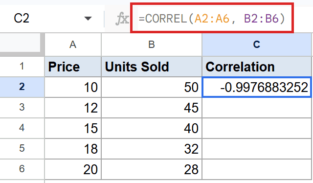
The formula returns roughly -1.00, a near-perfect negative correlation. Every dollar of price increase comes paired with fewer units flying off the shelf.
You’ll often see CORREL alongside the AVERAGE function and other summary stats when you’re profiling a small dataset.
Tips & Common Mistakes
- Both ranges must be the same size. If data_y has five values and data_x has six, CORREL returns a #N/A error. Trim them to match first.
- Correlation is not causation. A coefficient near 1 or -1 means the two columns move together, not that one causes the other. Use it as a hint, not a verdict.
- Use SUMIF function for filtered slices. When you only want the correlation for a subset of rows, filter the data first with a helper column rather than feeding raw ranges to CORREL.
CORREL is the fastest way to sense-check whether two columns of numbers move together. The output sits between -1 and 1, so it’s easy to read at a glance. Use it before you build heavier models to make sure the relationship is worth chasing.
List of All Google Sheets Functions
Related Google Sheets Functions / Articles: